New Google Workspace icons redesign is more than just a visual refresh. After years of criticism around the “same four-color” design language, Google is finally giving apps like Gmail, Drive, Docs, Meet, and Calendar a more distinct identity.
What Changed in the New Google Icons?
The biggest visual change is the move away from Google’s old “four-color everywhere” approach.
Back in 2020, when Google transformed G Suite into Google Workspace, nearly every app icon adopted the same mix of red, blue, green, and yellow. While the branding looked unified, users often complained that apps became difficult to distinguish quickly.
Now Google is reversing that direction.
The new redesign introduces:
-
Soft gradient transitions
-
Stronger dominant colors per app
-
More recognizable shapes
-
Cleaner and larger icon layouts
-
Reduced visual clutter
Why the Change? Solving the “Sea of Sameness”
For the past few years, Google’s “Material Design” philosophy mandated that every icon—whether it was for email, storage, or spreadsheets—must use the same four brand colors (red, blue, green, and yellow). While it looked cohesive on a brand deck, it was a nightmare for productivity. Users constantly complained that they couldn’t distinguish between Google Drive and Google Calendar at a glance.
Also Google’s products are increasingly powered by AI:
-
Gemini inside Gmail
-
AI writing in Docs
-
Smart summaries in Meet
-
AI-powered Sheets analysis
-
Workspace automation tools
The softer gradients and dynamic visuals create a more modern and “AI-native” appearance that feels connected across Google services.
In short: Google no longer wants Workspace apps to look like static productivity tools.It wants them to feel like intelligent assistants.
Key Workspace Changes You’ll Notice
The update is most apparent in the Google Workspace suite. Here is the breakdown of the biggest shifts:
-
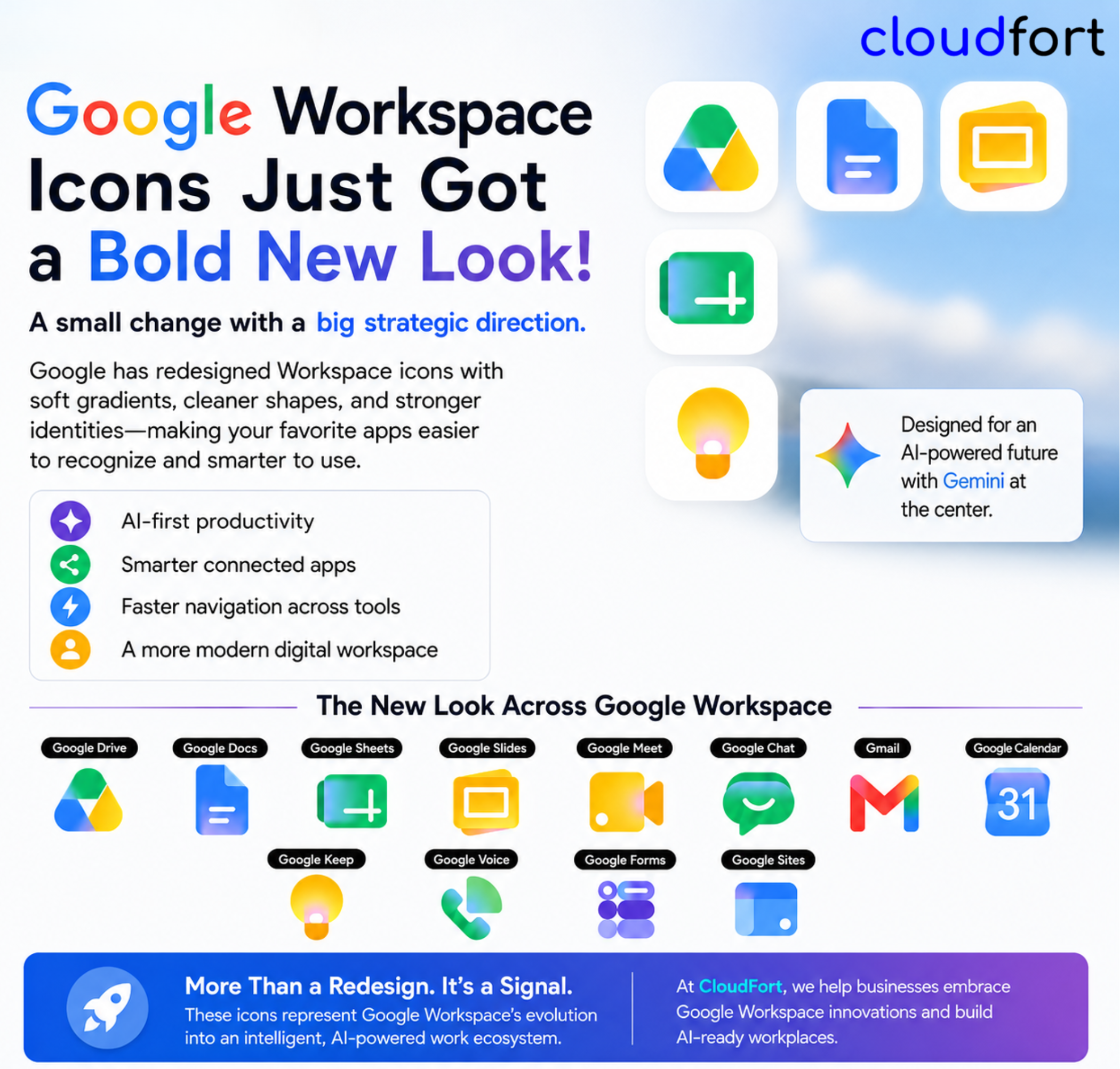
Gmail: The iconic “M” envelope remains, but it has traded its flat, rigid lines for soft, vibrant gradients. It remains the only icon to feature all four colors prominently, maintaining its status as the anchor of the suite.
-
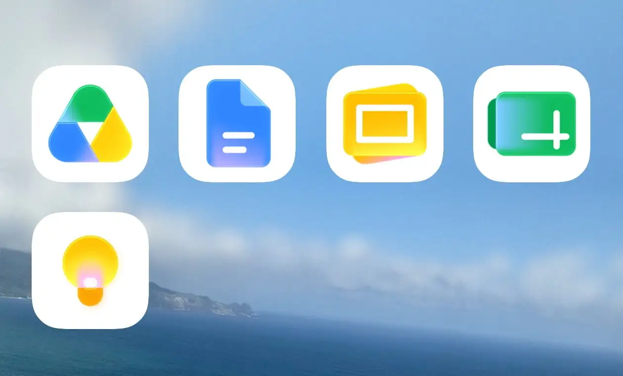
Google Drive: The “red” is gone. The triangle now blends green, yellow, and blue seamlessly, giving it a much cleaner and less cluttered appearance.
-
Docs, Sheets, and Slides: Google has officially removed the “white page container.” Previously, these icons sat on a white sheet-like background. Now, the symbols themselves are larger and more distinct—Docs is a deeper blue, Sheets is a vibrant green, and Slides is a bold yellow.
-
Google Calendar: In a win for usability, Calendar has returned to a primarily blue focus, making it stand out instantly against the other apps in your taskbar.
-
Google Meet & Chat: These have seen perhaps the most radical departures. Chat has moved to a friendly green “blob” style, while Meet focuses on a simplified, high-contrast video camera icon.
The Role of AI in Google Workspace
If these new icons look familiar, it’s because they share a DNA with Gemini, Google’s flagship AI. The use of soft-focus gradients is intended to represent the “fluidity” and “adaptability” of AI-integrated workflows. As Google Workspace becomes more powered by Gemini, the design language is shifting to match that “ever-evolving” tech aesthetic.
The timing of this redesign is important.Google Workspace is rapidly evolving from a productivity suite into an AI-powered work platform. Today, Workspace already includes:
-
AI email drafting in Gmail
-
Smart document generation in Docs
-
AI summaries in Meet
-
Spreadsheet assistance in Sheets
-
Workflow automation integrations
-
AI-powered search and organization
Google is positioning Workspace as a central hub where AI becomes part of everyday work instead of a separate tool. The icon redesign is essentially the visual layer of that transformation.
It signals: “These apps are becoming smarter, more connected, and more intelligent
Where Can You See the New Icons?
The rollout is happening in stages:
-
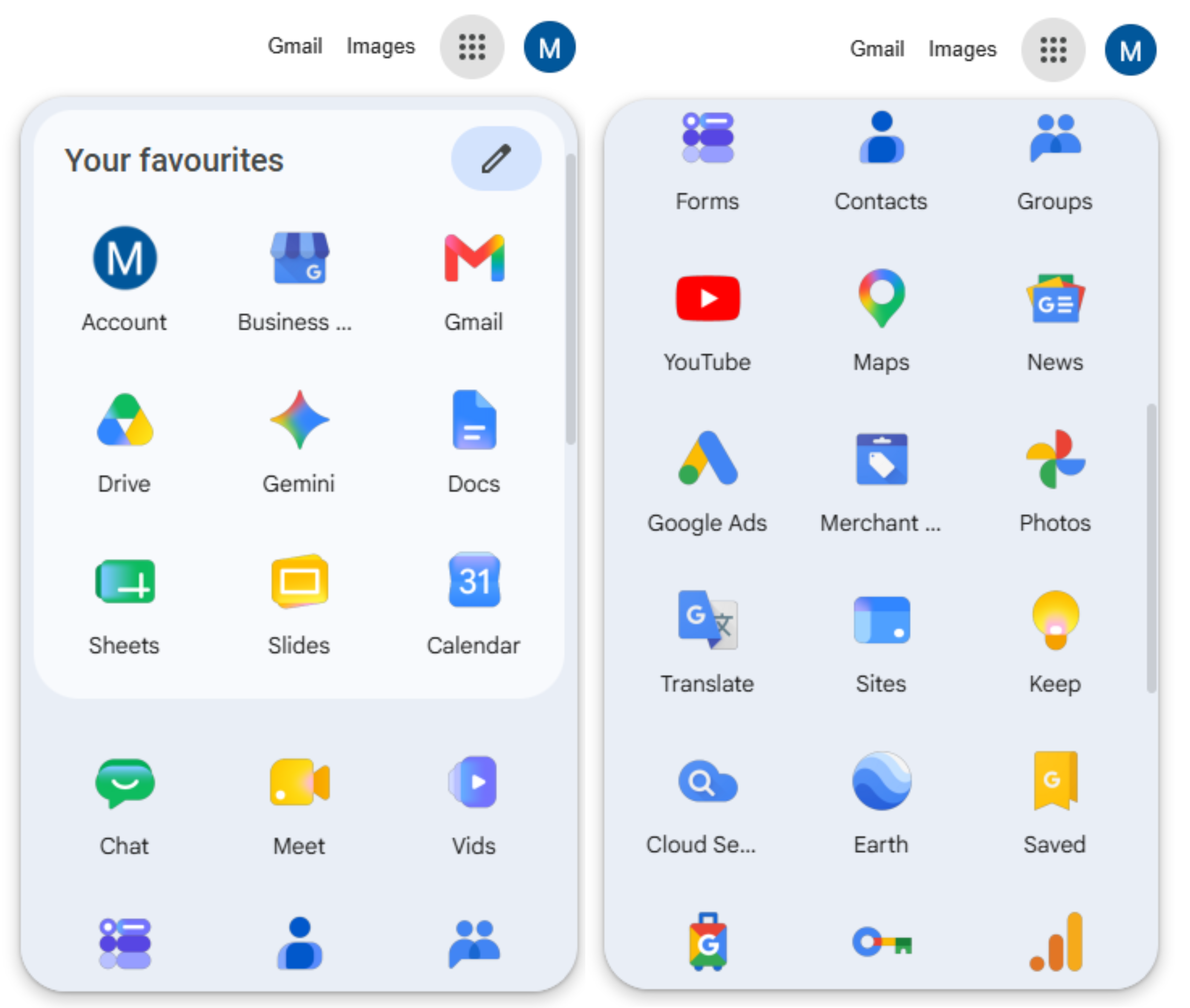
Web App Launcher: Most users can see the new icons right now in the “nine-dot” grid in the top-right corner of Google.com or Chrome’s New Tab page.
-
Mobile Apps: Android and iOS updates are currently rolling out, so keep an eye on your app store updates.
-
Editor Pages: While the icons are updated in the launcher, the actual “favicons” (the tiny icons on your browser tabs) and the logos inside the document editors are expected to transition in the coming weeks.
The Rollout Has Already Started
The rollout began appearing across:
-
Google web app launchers
-
Chrome New Tab pages
-
Some Workspace web apps
However, the transition is still incomplete. Some favicons and editor pages still use older icons for now. Mobile rollouts on Android and iOS are expected to continue gradually. Google is likely to expand this redesign further during and after Google I/O 2026.
Final Thoughts
This may look like “just another icon redesign,” but it represents something much bigger. Google is redefining how users interact with productivity software and Google has made its Workspace apps more accessible, more distinct, and—honestly—a lot easier on the eyes
The company is moving:
-
from static tools → intelligent systems
-
from uniform branding → recognizable usability
-
from traditional productivity → AI-powered workflows
And Google Workspace sits at the centre of that evolution.
For businesses, creators, educators, and teams already working inside Google Workspace, these changes are a reminder that the future of work is becoming increasingly AI-driven — and Google wants every visual detail to reflect that.